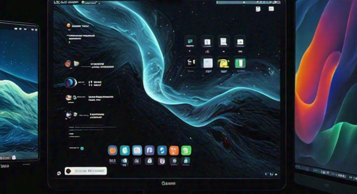
How Dark Mode is Changing UI/UX Design. In recent years, dark mode has transformed from a niche feature to a widespread design trend in user interfaces (UI) and user experiences (UX). Major platforms like iOS, Android, and popular websites have integrated dark mode options into their designs, giving users the flexibility to switch between light and dark themes. While dark mode was initially praised for its aesthetic appeal, it has also introduced a significant shift in UI/UX design principles, emphasizing not only user preferences but also accessibility and functionality.
This article explores how dark mode is changing the landscape of UI/UX design and what designers should consider when creating dark mode interfaces.
The Rise of Dark Mode
Dark mode refers to a color scheme that uses light-colored text and icons on a dark background. While the concept isn’t entirely new (it has its roots in the early days of computing when monitors had black backgrounds and green text), its modern resurgence is driven by user demand for visual comfort and energy efficiency.
Major companies, from Google to Apple, have embraced dark mode, and studies suggest that users find it easier on the eyes, especially in low-light environments. It can also help conserve battery life on OLED screens, adding to its appeal.
Impact on UI/UX Design
1. Visual Comfort and Accessibility
One of the primary reasons users choose dark mode is for the visual comfort it provides. For users who spend extended hours in front of screens, dark mode can reduce eye strain by lowering the overall brightness. This makes it especially beneficial in dimly lit environments.
However, this change in brightness also introduces new design challenges. Ensuring sufficient contrast between text and background in dark mode is crucial for readability. Colors that work well in light mode may not offer the same clarity in dark mode, and poor contrast can lead to difficulty in reading text, straining users’ eyes rather than alleviating it.
To optimize dark mode for accessibility, designers need to consider color choices carefully. The use of high-contrast elements, legible fonts, and clear visual hierarchy ensures that users, regardless of visual impairments, can comfortably interact with the interface.
2. Aesthetic Appeal and Brand Identity
Dark mode’s sleek, modern look has become synonymous with minimalism and sophistication. It often brings out a sense of professionalism in an interface, making apps or websites appear more polished and high-end. For UI/UX designers, incorporating dark mode into a brand’s identity can offer a fresh and distinctive look, especially when done with attention to detail.
However, maintaining brand consistency across light and dark modes is key. Some brand colors may not look as vibrant or consistent when placed on a dark background. Designers may need to tweak these brand elements, such as logos or accent colors, to maintain the brand’s identity while ensuring legibility and balance in dark mode.
3. Energy Efficiency and Sustainability
One of the more technical reasons why dark mode has gained popularity is its potential for energy savings. On devices with OLED or AMOLED screens, pixels are turned off or dimmed to display black, reducing the device’s energy consumption. This leads to longer battery life, especially for users who spend a significant amount of time on their phones or laptops.
From a UX perspective, this adds a layer of user satisfaction. Not only is the interface easier on the eyes, but it’s also conserving battery power, creating a more efficient and user-friendly experience.
4. Psychological Effects and User Behavior
Dark mode can also influence user behavior and emotions. According to research in color psychology, darker tones tend to evoke feelings of calmness and focus. This is one reason why many users prefer dark mode for reading or working at night. It creates a subtle, non-intrusive experience that allows users to concentrate without being overstimulated by bright, vibrant colors.
For designers, this means considering the user’s emotional state when interacting with dark mode interfaces. Dark mode is generally perceived as more formal, whereas light mode is often seen as more casual and friendly. Therefore, the choice of using dark mode or light mode should align with the user’s task and environment.
Best Practices for Designing in Dark Mode
Designing for dark mode is not as simple as inverting colors from a light mode design. Here are a few best practices for creating effective dark mode UI/UX designs:
- Maintain Contrast: Ensure sufficient contrast between the text and background to avoid eye strain. Use lighter shades of text to enhance readability without going to pure white, which can be too harsh.
- Avoid Pure Black: Instead of using pure black (#000000), opt for dark gray shades. This reduces the stark contrast and makes the design look softer and more comfortable for users.
- Test in Different Environments: Always test the design in various lighting conditions to ensure it looks good in both bright and dim environments.
- Adjust Brightness of Colors: Some colors that work well in light mode might appear too bright or muted in dark mode. Adjust them to maintain consistency without sacrificing clarity.
- Consistency Across Modes: Ensure that the visual language remains consistent across both dark and light modes. Users should not feel disoriented when switching between modes.
Conclusion
Dark mode is more than just a trend; it has become a staple feature that significantly impacts the way users interact with digital products. As designers, the challenge lies in balancing aesthetics, accessibility, and functionality while catering to users’ preferences. With careful planning and thoughtful design choices, dark mode can elevate the user experience by offering comfort, sustainability, and a modern look.
FAQs
1. What is dark mode in UI/UX design?
Dark mode refers to a user interface design that features light text and elements on a dark background, providing users with a visually comfortable and energy-efficient alternative to light mode.
2. Why is dark mode popular?
Dark mode is popular due to its aesthetic appeal, reduced eye strain in low-light environments, and the energy efficiency it offers on OLED screens.
3. Does dark mode save battery?
Yes, dark mode can save battery on devices with OLED or AMOLED screens by reducing the power needed to display black pixels.
4. How does dark mode impact accessibility?
Dark mode can reduce eye strain, but designers must ensure proper contrast and legibility to avoid accessibility issues, especially for users with visual impairments.
5. What are best practices for designing dark mode interfaces?
Best practices include maintaining high contrast, avoiding pure black, adjusting colors for readability, and ensuring design consistency between light and dark modes.


